Components
When editing a regular page, your content will be set up in the form of components.
Components are single pieces of content that you add to you page, and the type of component you add will determine how that content is displayed.
You can add as many components to your page as you wish, and they will be ordered in the order they are stacked in your backoffice. You can sort these by dragging them around after you have created them however, so no need to consider the order in which you create them!
As an example if you chose to add a text block component with some text content, and then an image component with your image, these two will be rendered on top of each other in your page's front end.
If however you were to use a "text and image" component, you would be able to render your text and your image next to each other horizontally, as that component is made to do just that.
The component overview
When you first open up a regular page in the backoffice, your components will be presented like this (if you have added any):

Clicking any of these components will open up the editor window, here you will find all available inputs on that specific component. Remember, some components that have more available inputs may organize these in tabs, you will find these on the top of your component editor panel!
If you would like to order your components around you can do so easily by simply dragging them around and dropping them where you would like them to sit. Remember, these are rendered on your page's front-end in the order they are stacked in your backoffice from top to bottom.
Adding components
So, ready to add a new component to your page? No problem! At the bottom of the component overview you will always see the "Add content" button. If you click this you will be presented with this panel of available components:

More on what these are and how you can use them further down below. For now, find the component you wish to add and click it, you will be immediately transferred to the component editor panel where you can start adding your content. Remember to click submit when you're finished!

The component editor panel looks like this, of course available inputs differ between component types. Do however note the tabs at the top, sometimes you will find more inputs are available to you if you click these!
Component types
Here we will take a quick look at what you can expect from each available component type. We will cover the basics here, but do feel free to try any of these out at any time for learning, we have test environments for a reason!
Copying components
There is a built-in feature available for adding a component to your clipboard and pasting this into another compatible component editor. This feature comes in handy when you wish to maintain certain settings in a component, like colors etc. Simply copy that component and paste it somewhere else, then change the content you wish to change before saving!
To copy a component simply hover over it in the component list, find the copy button:
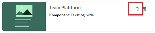
Once you press the button that component will be added to your component clipboard and can now be used in other component editors that accepts this component type.
Now find the editor where you wish to use this component and find the clipboard button next to the "Add content" button:

With that out of the way, let's take a look at how you can use some of the building blocks found in these components in your markdown files!